Redesigning Florence Nightingale's Rose Diagram
The Original Graphic (1858)
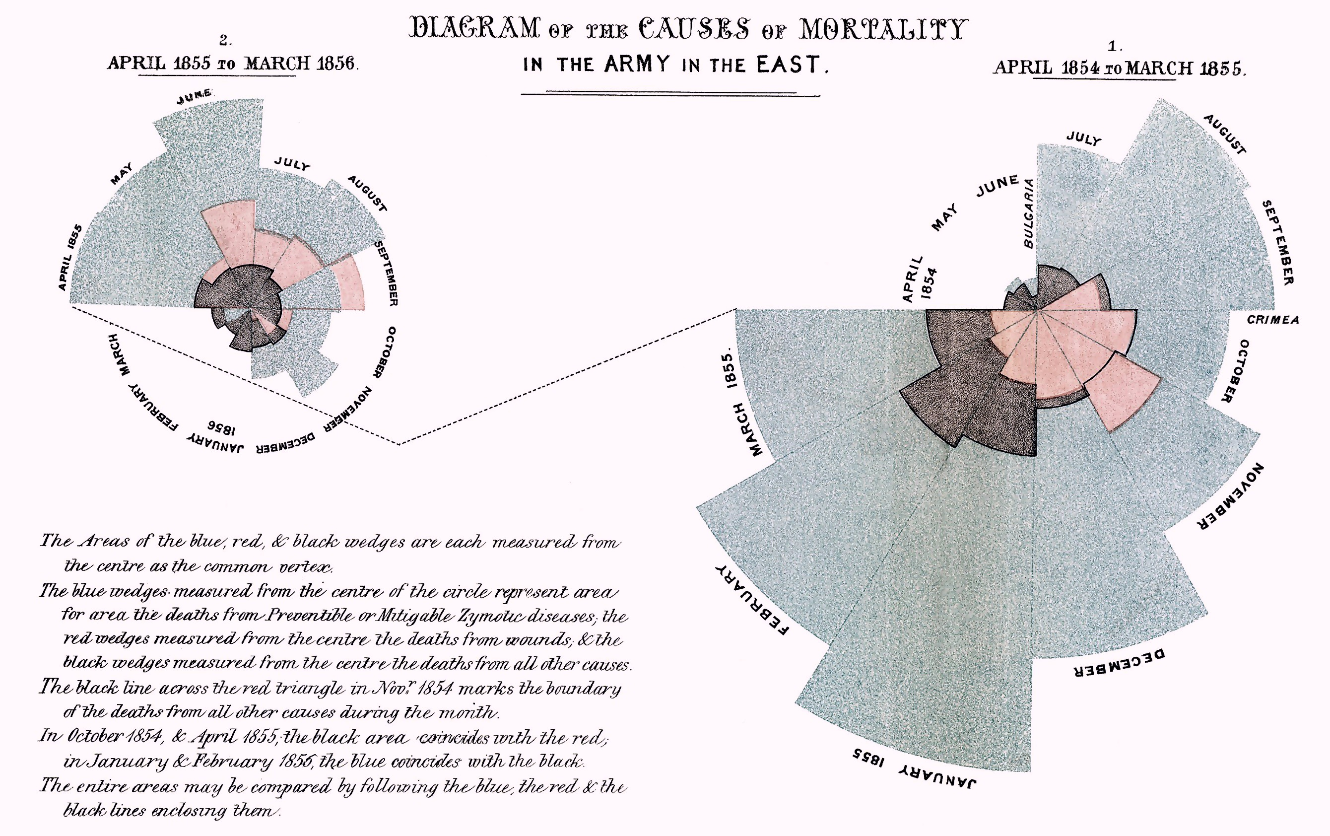
Florence Nightingale created this polar area diagram (often called the "Rose Diagram" or "Coxcomb") to illustrate the causes of mortality among British soldiers during the Crimean War (1854–1856). Her goal was to convince military and government officials that most deaths were preventable, caused by disease rather than battle wounds.
Reading the Original
- Blue wedges: Deaths from preventable diseases (cholera, typhus, dysentery)
- Red wedges: Deaths from battle wounds
- Black wedges: Deaths from all other causes
Each wedge represents one month, with the area proportional to the death count. The diagram is split into two charts: April 1854–March 1855 (right) and April 1855–March 1856 (left).
Why Redesign?
While revolutionary for its time, the polar format has limitations:
- Difficult comparisons: Areas in polar charts are harder to compare than linear bars
- No common baseline: Each wedge starts from the center, making precise comparison challenging
- Split visualization: The two-chart layout interrupts the timeline narrative
- Missing context: Army size fluctuated significantly, affecting interpretation of raw death counts
My Redesign Approach
I chose a stacked bar chart with dual y-axes to address these issues:
- Stacked bars show absolute death counts by cause, preserving Nightingale's original color scheme (blue for disease, red for wounds, grey for other)
- Line overlay shows death rates per 1,000 soldiers, accounting for army size changes
- Linear timeline makes month-to-month trends immediately visible
- Single unified chart tells the complete story without splitting the data
Exploring the Data

The graph above reveals crucial context missing from Nightingale's original: army size varied dramatically over the war. Deaths peaked in winter 1854–55 when the army was also at its largest, but the rate of death tells a more nuanced story.
The Redesigned Visualization

Key Insights
The redesigned chart reveals Nightingale's core message with greater clarity:
- Disease dominated mortality: The blue bars and lines dwarf all other causes throughout the war
- January 1855 was catastrophic: Disease deaths peaked at over 1,000 soldiers in a single month, with a rate exceeding 1,000 per 1,000 (meaning the equivalent of the entire army died from disease that month)
- Sanitation reforms worked: After Nightingale's sanitary improvements in spring 1855, disease death rates plummeted dramatically
- Battle wounds were secondary: Despite being a war, combat injuries (red) caused far fewer deaths than preventable disease
Nightingale's advocacy for improved sanitation, clean water, and proper ventilation in military hospitals saved countless lives, a message this redesign aims to communicate even more powerfully than the original.